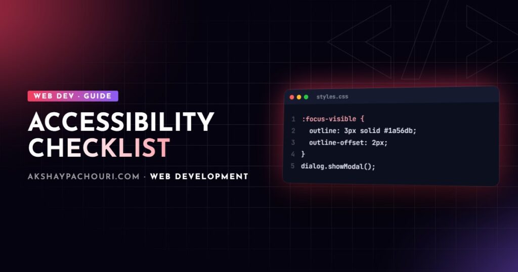
Most accessibility problems on real websites are not exotic. They are missing labels, divs pretending to be buttons, invisible focus outlines and grey-on-grey text. This web accessibility checklist walks through the fixes developers can make in code, in the order I check them, with snippets you can drop into a project today.
The target throughout is WCAG 2.2 level AA, which is what most accessibility laws and procurement requirements point to. Automated tools catch only part of it, so the checklist ends with a manual testing routine as well.
1. Start with semantic HTML
Native elements come with keyboard support, focus handling and screen reader roles for free. A <button> is focusable, fires on Enter and Space, and announces itself as a button. A <div onclick> does none of that until you rebuild it by hand, and the rebuilt version is usually incomplete.
- Use
<button>for actions and<a href>for navigation. A link without anhrefis not focusable. - Use
<ul>/<ol>for lists of things, including navigation menus and card grids. - Use
<table>with<th scope>for tabular data, never for layout. - Set the page language:
<html lang="en">. Screen readers use it to pick pronunciation.
<!-- Avoid -->
<div class="btn" onclick="addToCart()">Add to cart</div>

<!-- Prefer -->
<button type="button" class="btn" onclick="addToCart()">Add to cart</button>
2. Headings and landmarks for navigation
Screen reader users rarely read a page top to bottom. They jump between headings and landmarks, so those two structures are effectively your table of contents.
- One
<h1>per page describing its main purpose. - Headings in a logical order. Do not skip from
<h2>to<h4>because the<h4>looked the right size; style with CSS instead. - Wrap regions in landmark elements:
<header>,<nav>,<main>,<aside>,<footer>. - If there is more than one
<nav>, label each one so they can be told apart. - Add a skip link as the first focusable element so keyboard users can bypass repeated navigation.
<a class="skip-link" href="#main">Skip to content</a>
<header>
  <nav aria-label="Primary">…</nav>
</header>
<main id="main" tabindex="-1">
  <h1>Product configurator</h1>
  …
</main>
<footer>
  <nav aria-label="Footer">…</nav>
</footer>
3. Keyboard access and visible focus
Unplug your mouse and press Tab through the page. Every interactive element must be reachable, operable and visibly focused, in an order that matches the visual layout. Avoid positive tabindex values; they create a separate tab order that almost always ends up confusing.
Use :focus-visible instead of removing outlines
The classic mistake is outline: none on everything because designers disliked the ring on mouse click. :focus-visible solves that: browsers apply it when focus should be shown (typically keyboard navigation) and skip it for most mouse clicks.
:focus-visible {
  outline: 3px solid var(--focus-ring, #1a56db);
  outline-offset: 2px;
}

/* Only hide the default ring when focus-visible is supported */
:focus:not(:focus-visible) {
  outline: none;
}

.skip-link {
  position: absolute;
  left: 1rem;
  top: -100px;
}
.skip-link:focus {
  top: 1rem;
}
WCAG 2.2 added Focus Not Obscured (Minimum): a focused element must not be completely hidden by sticky headers, cookie banners or chat widgets. If you use a sticky header, scroll-padding-top on the html element keeps focused items clear of it.
Trap focus inside modals
When a modal opens, focus should move into it, stay inside it while it is open, close on Escape, and return to the trigger when it closes. The native <dialog> element opened with showModal() handles most of this: the rest of the page becomes inert, Escape closes it, and browsers return focus to the previously focused element on close.
<button type="button" id="open-size-guide">Size guide</button>

<dialog id="size-guide" aria-labelledby="size-guide-title">
  <h2 id="size-guide-title">Size guide</h2>
  <p>…</p>
  <button type="button" id="close-size-guide">Close</button>
</dialog>

<script>
  const dialog = document.getElementById('size-guide');
  document.getElementById('open-size-guide')
    .addEventListener('click', () => dialog.showModal());
  document.getElementById('close-size-guide')
    .addEventListener('click', () => dialog.close());
</script>
If you must build a custom modal, apply the inert attribute to everything outside it while it is open. That removes background content from both the tab order and the accessibility tree, which is more robust than hand-written Tab key loops.
4. Labels for every form control
Placeholder text is not a label. It disappears on input, often fails contrast, and is not reliably announced. Every input needs a programmatically associated label, and errors need to be announced, not just coloured red.
<label for="email">Email address</label>
<input id="email" name="email" type="email"
       autocomplete="email" required
       aria-describedby="email-hint email-error">
<p id="email-hint">We only use this for order updates.</p>
<p id="email-error" role="alert" hidden>Enter a valid email address.</p>- Use correct
typeandautocompletevalues so browsers and assistive tech can help users fill forms. - Group related radio buttons and checkboxes with
<fieldset>and<legend>. - Icon-only buttons need an accessible name, either visually hidden text or
aria-label. - Make tap targets at least 24 by 24 CSS pixels (or spaced so they don’t overlap), per the WCAG 2.2 Target Size (Minimum) criterion.
5. Alt text that does a job
Alt text should convey what the image contributes in context, not describe pixels. Ask what a sighted user gets from the image and write that.
- Informative images: short description of the content or meaning.
- Decorative images:
alt=""so screen readers skip them. Omitting the attribute entirely makes some screen readers read the filename. - Linked images: describe the destination, e.g.
alt="Akshay Pachouri – home"for a logo link. - Charts and diagrams: brief alt plus the full data or explanation in surrounding text.
- Inline SVG icons used decoratively get
aria-hidden="true".
6. Colour contrast under WCAG 2.2 AA
The AA thresholds have not changed in WCAG 2.2:
| Content | Minimum contrast ratio |
|---|---|
| Normal body text | 4.5:1 |
| Large text (roughly 24px regular or 18.66px bold and above) | 3:1 |
| UI components and meaningful graphics (input borders, focus rings, icons) | 3:1 |
Check contrast in design tokens, not page by page. If --text-muted passes against every background it is used on, every component using it passes. Also check hover, focus, disabled-looking-but-active and dark mode states, which are often forgotten. Never use colour alone to convey meaning: pair red error borders with an icon or text.
7. ARIA only when HTML can’t do it
The first rule of ARIA is not to use it if a native element works. ARIA changes what assistive technology announces but adds no behaviour; role="button" does not make a div keyboard operable. Wrong ARIA is worse than none, because it actively misinforms users.
Where ARIA earns its place is in states and relationships that HTML lacks:
<button type="button" aria-expanded="false" aria-controls="filters">
  Filters
</button>
<div id="filters" hidden>…</div>

<!-- Announce async updates such as "3 results found" -->
<p aria-live="polite" id="result-count"></p>
const toggle = document.querySelector('[aria-controls="filters"]');
const panel = document.getElementById('filters');
toggle.addEventListener('click', () => {
const open = toggle.getAttribute('aria-expanded') === 'true';
toggle.setAttribute('aria-expanded', String(!open));
panel.hidden = open;
});For complex widgets such as tabs, comboboxes and menus, follow the patterns in the WAI-ARIA Authoring Practices Guide rather than inventing keyboard behaviour. In React, well-tested headless libraries are usually a safer bet than hand-rolled widgets.
8. Respect prefers-reduced-motion
Parallax, large zooms and auto-playing animation can trigger nausea for people with vestibular disorders. Users who enable reduced motion in their OS settings should get a calmer version of the site.
@media (prefers-reduced-motion: reduce) {
  *,
  *::before,
  *::after {
    animation-duration: 0.01ms !important;
    animation-iteration-count: 1 !important;
    transition-duration: 0.01ms !important;
    scroll-behavior: auto !important;
  }
}
const reduceMotion = window.matchMedia('(prefers-reduced-motion: reduce)');
if (!reduceMotion.matches) {
startHeroAnimation(); // e.g. a GSAP or Three.js intro
}This matters for 3D and scroll-driven work in particular. If you build scenes like those in my Three.js scroll animations guide, skip the camera fly-through and show the final state when reduced motion is requested. Anything that moves for more than five seconds also needs a pause control.
9. Test with axe, Lighthouse and a real screen reader
Automated tools are fast and catch a meaningful share of issues like missing labels, contrast failures and invalid ARIA, but they cannot judge whether alt text makes sense or a custom widget is usable. Use both kinds of testing.
Automated checks
- axe DevTools browser extension or Lighthouse accessibility audit in Chrome DevTools for page-level scans.
- eslint-plugin-jsx-a11y in React projects to catch problems at write time.
- axe-core in CI so regressions fail the build:
// tests/a11y.spec.ts (Playwright + @axe-core/playwright)
import { test, expect } from '@playwright/test';
import AxeBuilder from '@axe-core/playwright';

test('home page has no detectable a11y violations', async ({ page }) => {
  await page.goto('/');
  const results = await new AxeBuilder({ page })
    .withTags(['wcag2a', 'wcag2aa', 'wcag21aa', 'wcag22aa'])
    .analyze();
  expect(results.violations).toEqual([]);
});
Manual checks
- Keyboard only: Tab, Shift+Tab, Enter, Space, Escape and arrow keys through every key flow.
- Screen reader: NVDA with Firefox or Chrome on Windows, VoiceOver with Safari on macOS and iOS, TalkBack on Android. Navigate by headings and landmarks, then complete a form.
- Zoom to 200% and 400% and check that content reflows without horizontal scrolling.
- Turn on reduced motion and a high-contrast or forced-colours mode.
Accessibility and performance overlap more than people expect; semantic, lightweight markup also helps the scores in my Core Web Vitals checklist.
Key takeaways
- Native HTML elements solve most accessibility problems before you write any ARIA.
- Headings, landmarks and a skip link make pages navigable for screen reader and keyboard users.
- Keep focus visible with
:focus-visible, and use<dialog>withshowModal()orinertfor modal focus management. - Every input needs a real label; every meaningful image needs useful alt text; decorative images get
alt="". - Meet WCAG 2.2 AA contrast: 4.5:1 for body text, 3:1 for large text and UI components.
- Combine axe or Lighthouse in CI with manual keyboard and screen reader testing.
Frequently asked questions
Is a Lighthouse accessibility score of 100 enough to meet WCAG?
No. Lighthouse and axe only test rules that can be checked automatically, so a perfect score still leaves things like alt text quality, focus order and widget usability unverified; you need manual keyboard and screen reader testing as well.
What changed in WCAG 2.2 compared to 2.1?
WCAG 2.2 added criteria including Focus Not Obscured, Target Size (Minimum), Dragging Movements, Consistent Help, Redundant Entry and Accessible Authentication, and removed 4.1.1 Parsing as obsolete; the contrast requirements stayed the same.
Should I use an accessibility overlay widget?
I don’t recommend them, because overlays cannot fix inaccessible markup reliably and can interfere with users’ own assistive technology. Fixing the underlying HTML, CSS and JavaScript is the only dependable approach.
When should I use aria-label?
Use aria-label when an element has no visible text to name it, such as an icon-only button or when distinguishing multiple <nav> landmarks. If visible text exists, prefer it or reference it with aria-labelledby so the spoken and visible names match.
If you need an accessibility review of an existing site or want accessible components built into a new project, get in touch and I can help you prioritise and fix the issues that matter most.