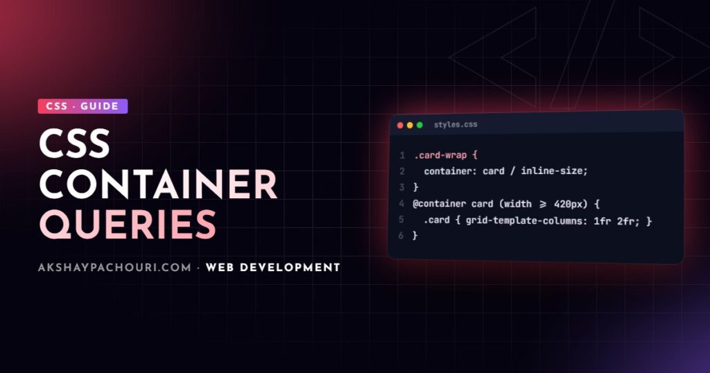
CSS container queries let a component respond to the size of its container instead of the size of the viewport, which is what reusable components needed all along. This guide covers container-type, @container, named containers, container query units, style queries, real card layout examples, fallbacks, and when media queries are still the right tool.
Why media queries are not enough for components
A product card might appear in a three-column grid on the homepage, a narrow sidebar, and a full-width search result. With media queries, the card only knows the viewport width, so on a wide screen it uses its “wide” layout even when squeezed into a 280px sidebar. You end up writing context-specific overrides like .sidebar .card, and the component stops being portable.
Container queries flip that around: the card asks “how much space do I have?” and adapts to that. Size container queries are supported in all modern evergreen browsers and have been for some time, so they are safe to use in production today.
container-type and @container basics
There are two steps. First, declare an element as a query container with container-type. Second, write @container rules that style its descendants.
.card-wrapper {
  container-type: inline-size;
}

.card {
  display: grid;
  gap: 1rem;
}

@container (min-width: 480px) {
  .card {
    grid-template-columns: 200px 1fr;
  }
}
Key rules to understand:
inline-sizelets you query the container’s width (in horizontal writing modes). This is what you want almost every time.sizeallows querying width and height, but applies size containment in both axes, so the container no longer gets its height from its content. You must give it an explicit height.- An element cannot query itself. The
@containerrule styles descendants of the container. That is why the example putscontainer-typeon a wrapper and styles the.cardinside it. - Queries match the nearest ancestor that is a container, unless you name one.
Range syntax works too and reads more naturally: @container (width >= 480px) or @container (400px < width < 700px).
A real example: a responsive card layout
Here is a card that stacks vertically when narrow, sits side by side at medium widths, and adds a larger title and extra metadata when wide. The same component works in any column without extra classes.
<div class="card-container">
  <article class="card">
    <img class="card__media" src="/img/chair.webp" alt="Oak lounge chair" width="600" height="400">
    <div class="card__body">
      <h3 class="card__title">Oak lounge chair</h3>
      <p class="card__meta">Solid oak · Hand finished</p>
      <p class="card__price">₹24,900</p>
    </div>
  </article>
</div>
.card-container {
container: card / inline-size;
}
.card {
display: grid;
gap: 0.75rem;
}
.card__media {
width: 100%;
height: auto;
aspect-ratio: 3 / 2;
object-fit: cover;
}
.card__meta {
display: none;
}
@container card (width >= 420px) {
.card {
grid-template-columns: minmax(0, 2fr) minmax(0, 3fr);
align-items: center;
}
}
@container card (width >= 640px) {
.card__title {
font-size: 1.5rem;
}
.card__meta {
display: block;
}
}Drop that markup into a grid where each cell is a container, and every card picks its layout from its own cell size:
.product-grid {
  display: grid;
  grid-template-columns: repeat(auto-fill, minmax(260px, 1fr));
  gap: 1.5rem;
}
Named containers
When containers are nested, an unnamed query matches the nearest one, which may not be the one you meant. Name containers with container-name, or use the container shorthand (name / type), and reference the name in the query:
.layout-main {
  container: main / inline-size;
}

.widget {
  container: widget / inline-size;
}

/* Responds to the main column, not the closer widget container */
@container main (width >= 900px) {
  .widget__header {
    flex-direction: row;
  }
}
A container can have multiple names separated by spaces, which is useful for design-system level names such as container-name: sidebar layout-column.
Container query units: cqi, cqw and friends
Container query units size things relative to the query container, similar to how vw relates to the viewport:
cqw/cqh: 1% of the container’s width / height.cqi/cqb: 1% of the container’s inline / block size. Prefer these for writing-mode-aware code.cqmin/cqmax: the smaller / larger ofcqiandcqb.
The standout use is fluid typography that scales with the component, not the screen:
.card__title {
  font-size: clamp(1rem, 0.75rem + 3cqi, 1.75rem);
}

.card__body {
  padding: clamp(0.75rem, 4cqi, 2rem);
}
Always clamp container units. Without a minimum, text in a narrow container can become unreadably small. If no ancestor is a container, these units fall back to the small viewport units, which can be surprising if you forget to set container-type.
Style queries (check browser support)
Style queries let you apply styles based on a container’s computed custom property value, rather than its size. Every element is a style container by default, so no container-type is needed:
.card-container[data-variant="featured"] {
  --variant: featured;
}

@container style(--variant: featured) {
  .card {
    border: 2px solid var(--accent);
    background: var(--surface-highlight);
  }
}
Support is the caveat. Style queries for custom properties are available in Chromium-based browsers and recent Safari, but at the time of writing they are not supported everywhere, and querying regular CSS properties (not custom properties) is not implemented in any browser. Check current support on MDN or caniuse before relying on them, and treat them as progressive enhancement. The same applies to newer experiments such as scroll-state queries.
Fallbacks for older browsers
If you must support browsers without container queries, design the default (unqueried) styles as the narrow, single-column layout. That layout works everywhere, and container queries progressively enhance it. Where you need an alternative wide layout for old browsers, wrap it in a feature query:
/* Old browsers: use viewport as an approximation */
@supports not (container-type: inline-size) {
  @media (min-width: 900px) {
    .card {
      grid-template-columns: 200px 1fr;
    }
  }
}
For most audiences today the fallback can be simply “the mobile layout”, which keeps the CSS small.
Gotchas: containment side effects
container-type: inline-size applies inline-size containment, meaning the container’s width cannot depend on its children. That causes two common surprises:
- Containers collapse in shrink-to-fit contexts. A container that is a flex item with no basis, an inline-block, or an absolutely positioned element sized by content can shrink to zero width. Give it an explicit width or
flex: 1. - Stacking and layout changes. Containment creates a new stacking context and containing block for some descendants, which can affect
z-indexand fixed positioning inside the container. If a dropdown suddenly gets clipped or layered wrongly, see why z-index is not working.
Also avoid making every element a container. Put container-type on layout wrappers and component roots where you actually query.
Container queries vs media queries
They complement each other:
- Use media queries for page-level layout (how many columns the page has, showing a mobile navigation), and for user preferences such as
prefers-reduced-motion,prefers-color-schemeandhover/pointercapabilities, which containers know nothing about. - Use container queries for components that appear in contexts of different sizes: cards, widgets, media objects, form groups, and anything in a CMS where editors drop blocks into arbitrary columns.
Container queries pair especially well with component systems such as WordPress blocks; see custom Gutenberg block development for a context where you rarely know a block’s final width.
Key takeaways
- CSS container queries style components by their container size, not the viewport.
- Use
container-type: inline-sizeon a wrapper and query descendants with@container. - Name containers to target the right ancestor when they are nested.
- Use clamped
cqiunits for fluid component typography and spacing. - Style queries are partially supported; treat them as progressive enhancement.
- Watch for containers collapsing to zero width in shrink-to-fit layouts.
Frequently asked questions
Are CSS container queries supported in all browsers?
Size container queries and container query units are supported in all current major browsers. Style queries have more limited support, so check MDN or caniuse before using them.
Why is my container query not working?
The usual causes are a missing container-type on an ancestor, trying to style the container itself instead of a descendant, or an unnamed query matching a closer container than intended.
What is the difference between container-type size and inline-size?
inline-size lets you query width only and leaves height determined by content, while size lets you query both but requires the container to have an explicit height.
Should I replace all media queries with container queries?
No. Keep media queries for page layout and user preference features, and use container queries for reusable components that appear in differently sized slots.
If you want a component library or site rebuilt with modern, maintainable CSS, get in touch and let’s talk about the project.